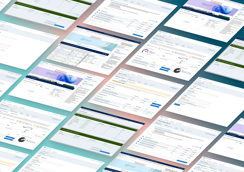
Accessibility Compliance Tool - Manual Testing
Problem Statement
The Accessibility Compliance Tool (ACT) allows users to check the accessibility of their site and is used by the Accessibility COE team to monitor accessibility compliance across all teams at Dell.
Users are not able to get the complete score since only about 30% of accessibility issues can be tested automatically through the tool and the rest require manual testing.
Process
This project will go into the research, prototyping and user testing of the addition of the feature of manual testing to the tool, a phase that we refer to as "ACT - M".
Outcome
After several rounds of research, iterations, feedback and testing, we created a manual testing flow for the tool in line with industry standards and our user's needs..
Summary - Stages of the Project
Competitive Analysis
Conceptual designs and flow
Stakeholder feedback and iterations
User testing process
Affinity Mapping and Insights
Iterations and final designs
Feedback and Reflections
The Accessibility Compliance Tool:
An introduction
Main Features -
-
Allows users to run an automated test on single or multiple URLs. (Create a Scan Page)
-
Gives users an accessibility score to let them check their level of compliance. (Scan Results Page)
-
Gives users information about the number of issues they have and steps to fix them. (Scan Results, Specific URL and Specific Issue Page)
-
Allows users to schedule scans to be able to track their progress over time. (Create a Scan and Scan History Page)
Main Users -
-
Product Owners
-
Product Leads
-
Engineers

Competitive Analysis
To better understand what features we would need to add to ACT, we decided to do a competitive analysis between the manual testing features of different accessibility tools namely - Accessibility Insights for Web, UsableNet AQA, Level Access Assistant, AxeDev Tools, Axe Auditor.
We looked at their overall user flows and features to inform our design. Our key areas of analysis were:
-
The explanation of manual testing and its importance.
-
Reporting methods in terms of format, score, data visualizations, scans over time and sharing data with the overall team.
-
World Content Accessibility Guidelines (WCAG) Coverage.
-
Testing methods - no. of steps, beginning a new step with another in progress, mid test saving, testing time captured and notifications

Please note that this is an abridged image of the competitive analysis.
Current and Proposed User Flows
First time user for a multi-URL scan
Current Flow
Create a Scan
Scan History
Scan Results
Specific URL
Specific Issue
Additional Flow
Manual Review
Manual Review URL List
Select URL
Manual Review Console (Needs Review)
Manual Review Console (Guided Manual Test)
Product Goals
Clearly communicate the uncertainty of the score.
Clearly differentiate the two manual testing phases.
Clearly communicate how manual testing changes the overall score.
Make sure that the product is developmentally feasible within our timeline
User Testing Process
We created a user testing outline and script with tasks that the users had to execute. We collected that data from each user in an Excel sheet and then moved those insights into a whiteboard for affinity mapping.
We also sent a follow-up survey so that we could understand our users' experience with the user testing process.
Tasks given to users -
-
Answer introductory questions.
-
Identify and explain the overall accessibility score.
-
Choose 4 URLs for manual review.
-
Complete manual review on one URL.
-
Check updated score.
-
Answer any additional questions.
Data points collected in rainbow spreadsheet

Outline and Script

Affinity Mapping


Main Insights from affinity mapping


Understanding the score
-
Most users interpreted the score correctly. It was not always clear that the color differences in the gauge were to show variance.
-
There is an opportunity to connect the variance portion better to the overall score.
-
The overall score should be current - users felt it should reflect work done so far (Manual Review Homepage).
Terminology
Users had trouble understanding the nuance of terms used within the application, including:
-
Manual (vs automated)
-
Issues to review (vs. Verified)
-
What "Manual Homepage" referred to.
-
Exactly what "passed" and "failed" mean (failed URLs, instances passed etc.)

UI Mismatch
Users' expectation of certain UI components did not match up to what was shown in the tool including:
-
Users saw starring URLs as favouriting items vs selecting them.
-
Users did not see going to the second tab in the Manual URl List page as a natural progression.
-
Users did not perceive the highlight color of to the box in the manual console to be prominent enough.
Issues with User Flow
-
Proceeding to manual testing could be a clearer CTA than just "Select URLs"
-
Interstitial Manual Console screens need to appear adequately different.
-
Flow within Manual Console needs to be clear - users should be able to return to the Manual Homepage at any point.
-
Users are not currently able to return from the manual console flow to the homepage without exiting the entire manual experience.
Main Screens
Scan Results
This page is a starting point to test multiple URLs. A user would upload their URL Excel file and create their scan

Manual Homepage
This page gives an overview of all things manual review. Users can view their score, their score range, what needs review and guided manual tests are, and finally go ahead and select URLs for testing.
This image shows the progress of a returning user whose accessibility percentage has gone up by 2% and they can see their remaining URLs and pick up from where they left off in this page

Manual Review URL List
Users can select the URLs they want to test. There is also guidance to help users understand which URLs they should prioritize.

Progress Summary
Users are directed to this page which outlines the two phases and gives them an overview of their progress.


Needs Review Page
Users can test the 6 sections of the needs review phase. They can pass or fail each instance with the help of the "How to Test" and "Description" sections. It gives users an idea of potential issues and how to verify them.
Section Summary
Users get an overview of the instances they have completed and the errors they have identified.
They can either go back and edit or move forward to the next section.

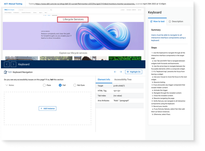
Guided Manual Test
The guided manual test guides the user through the keyboard section of the test. Users verify whether there are any instances which fail the success criteria.
Success
After users have successfully completed both phases, they can either edit their work or lock it for testing by the Accessibility team.

Accessibility Annotations
Accessibility annotations such as headings, tab stops, accessible names, link and buttons, and landmarks were added to all designs.

Impact and Feedback
After going through almost 3 different testing cycles, we were very confident with our MVP and were excited to see how users would respond to it, since this had been an ask from many of our users
20%
increase in accessibility score
60+
active users (specifically using the manual phase
71 %
Net Promoter Score
Overall Challenges
Some challenges we experienced during the process -
-
The designs were initially created in DDS 1 (earlier design system). The ask was to shift it to DDS 2 (new design system), however there were a lot of development issues with this change, and we had to go back and forth a lot between the two systems.
-
The scope of MVP 1 kept changing and it was hard keeping track of what needed to be done.
-
Team members were constantly changing which slowed down progress.